
sprintvisa
transparency-first visa service designed to turn anxiety into trust and word of mouth.
00

problem
Visa “agents” often run on opacity: unclear fees, vague timelines, and guarded advice. Users arrive anxious, afraid of rejection, and unsure what happens next. When trust is missing, every step feels risky.
solution
A transparency-first brand and UX system: - upfront, receipt-like pricing with clear breakup - step-by-step destination flows mapped to real embassy sequences - guarantees and policies framed as explicit commitments - fast, visible human support as a primary path - post-payment certainty via an application tracker and document vault
designing a transparency-first visa service that grows on trust, not ads
role: brand + product designer
stake: 3% equity (partner-level)
scope: identity system, website UX, visual language, content structure, trust mechanics
SprintVisa exists because the visa industry runs on fear.
people don’t hate forms. they hate uncertainty.

founders are avid travellers. they saw how most people feel lost with visas, and how many providers exploit that with hidden fees and vague advice. sprintvisa was built to be the opposite: transparent pricing, clear process, real support.
the outcome is simple and loud: insane word of mouth.
we spend close to nothing on CAC because customers bring family and friends en masse.
the problem
visa services have a trust deficit.
pricing is unclear till late
timelines feel like guesswork
requirements feel like “secret rules”
support is either slow or gated
users spiral into “what if i get rejected?”
in this category, your UI either calms the user or amplifies panic. most sites amplify it.
the design goal
make trust visible.
not as claims. as interface behavior.
users should feel, within seconds:
i know what this costs
i know what happens next
i can reach a human fast
someone is accountable
the approach
certainty UX: the calm guide
every screen was designed to reduce one of these:
ambiguity
delay anxiety
hidden-cost suspicion
process overwhelm
three core moves
1) show the math
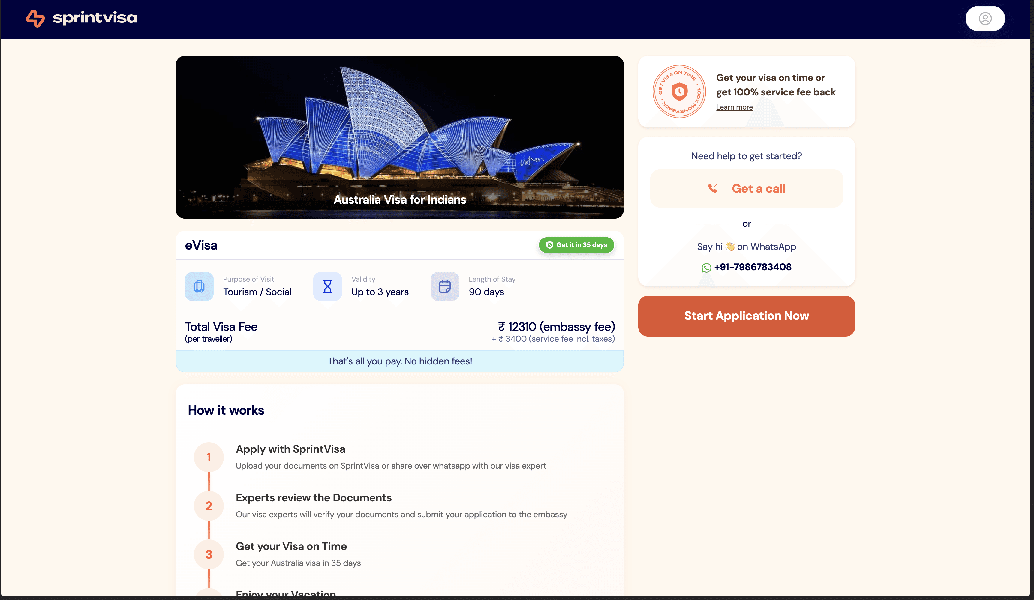
pricing should read like a receipt. upfront, broken down, non-negotiable.
2) make support a primary path
whatsapp is not a hidden “contact us” link. it’s a main CTA.
because responsiveness is the product.
3) structure the journey
destination pages and flows should turn a scary goal into steps.
apply → fees → appointment → biometrics → interview prep.
brand system
we avoided the cheap-agent aesthetic. no passport clip-art. no clutter.
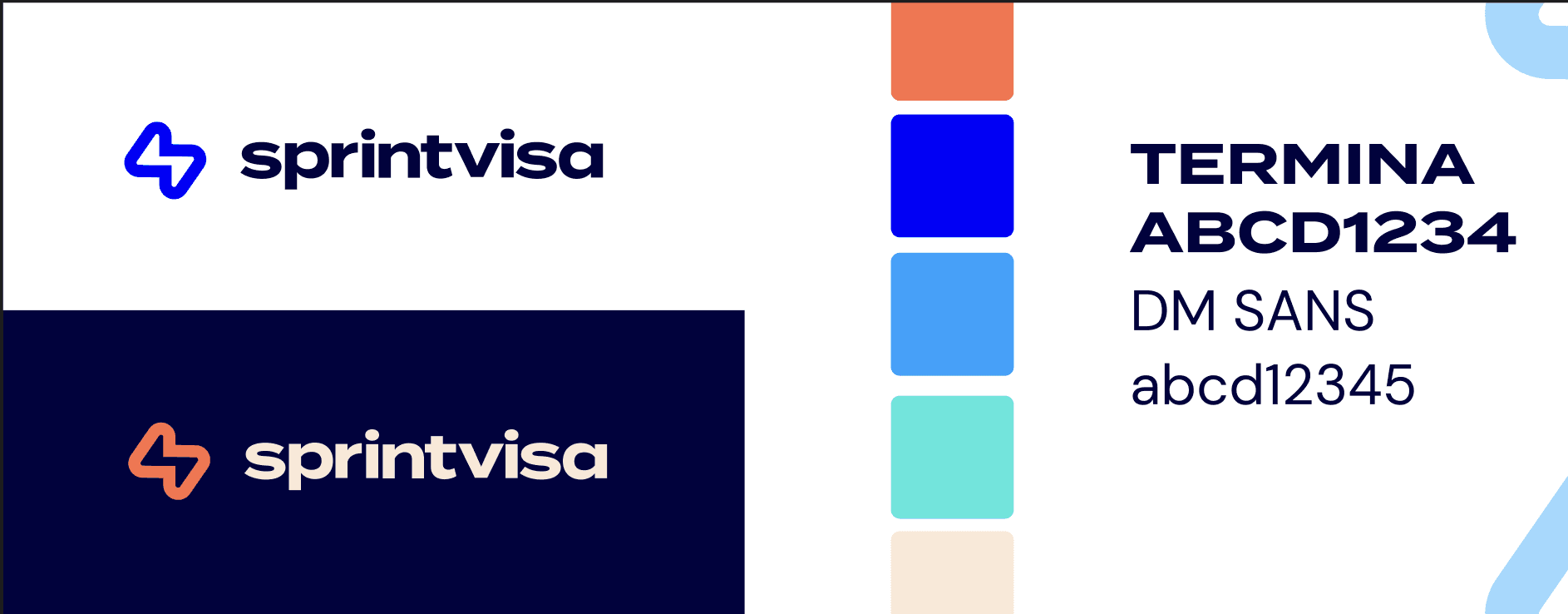
type: Termina (heads), DM Sans (body)
palette: vibrant blue core, white space, light beige warmth, coral-orange accents
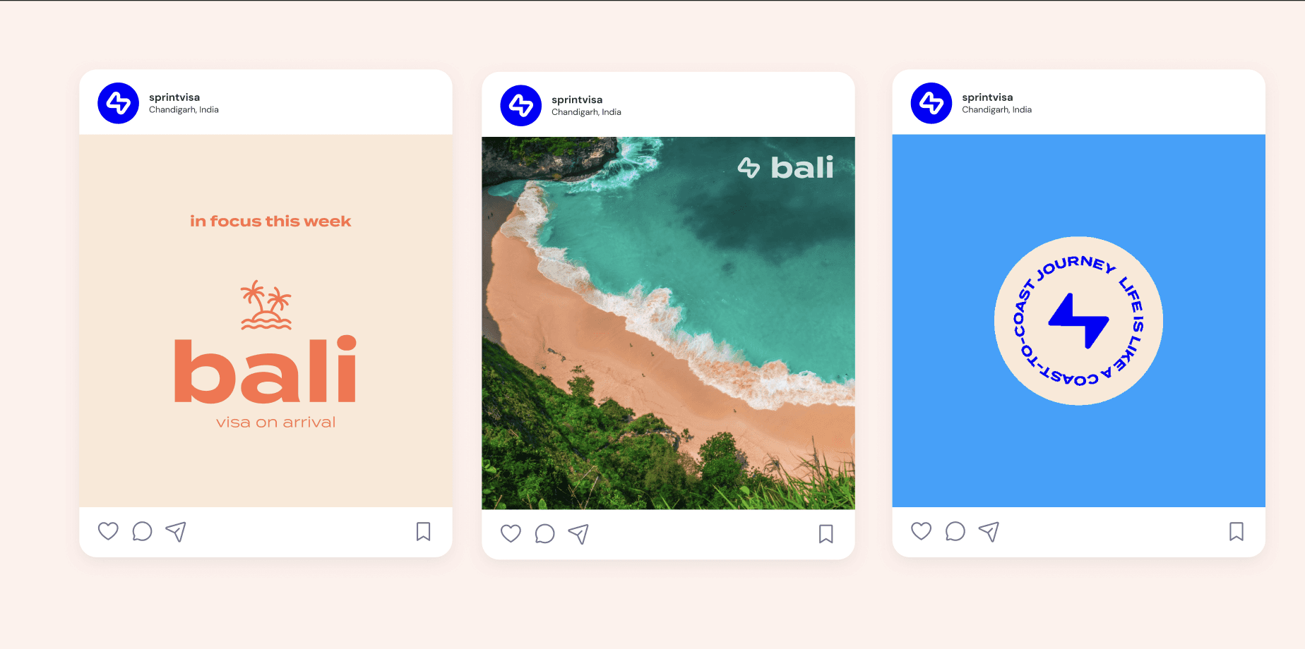
style: clean, travel-forward, rounded cards, strong CTAs, editorial imagery
language: layered visuals, modern gradients, motion-driven UI
logo: abstract chain-like symbol + wordmark
the vibe needed to say: modern, sharp, trustworthy. not “agent”.

product depth
multi-traveller applications
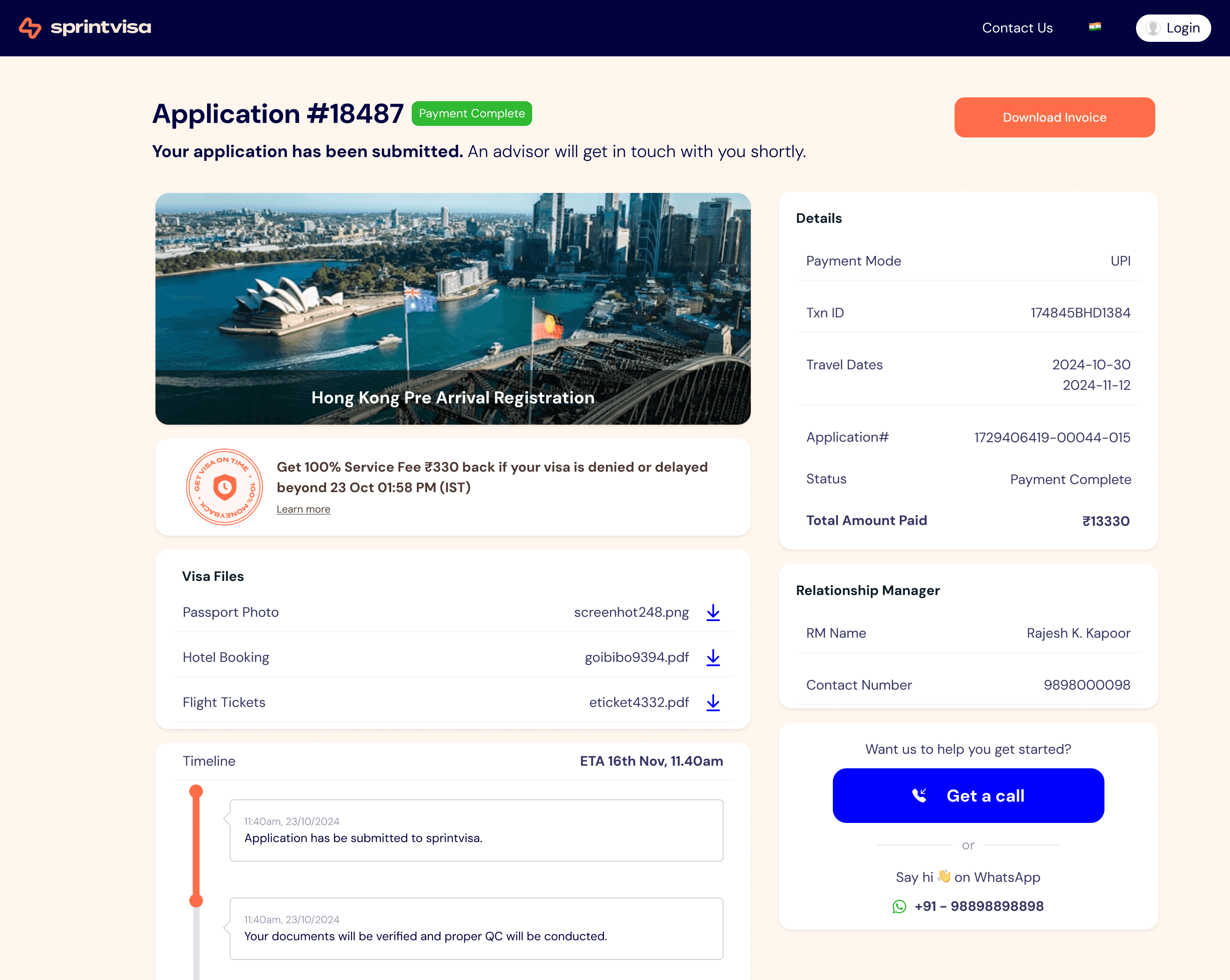
application tracker so users aren’t stuck in silence
document vault so travel doesn’t become a new reset every time
these two features attack the worst parts of the visa experience:
no visibility, and lost context.
in progress: building a b2b agent platform so trusted travel agents can run SprintVisa workflows at scale, with the same transparency, tracker, and document vault experience.
outcome
this design work did one job: earn trust fast, then keep it.
and when trust holds, growth becomes a loop:
one traveler uses it
then brings parents
then friends
then cousins
and sprintvisa spends close to nothing on paid acquisition
that’s the kind of growth you only get when the experience is genuinely reliable.

see also


