
krofile
brand identity system for local retention SaaS, that stays clear and consistent across product and marketing.
00

problem
krofile had a real product, but the brand was template-level and the story was diluted. too many features, no sharp hook. the website didn’t explain value fast enough for local business owners who scan and decide in seconds.
solution
built a repeatable brand identity system and redesigned krofile.com from IA to handoff. the result: a creative brand expression, and a website that communicates value clearly.
krofile brand strategy, identity system + marketing website
role: brand strategy, visual identity, krofile.com (IA → design → handoff)
timeline: 2 months (late 2024 → launched feb/march 2025)
context: freelance consultant, project based
krofile builds retention and growth tools for local businesses and small franchises like auto shops, dental practices, restaurants. owners are time-crunched, price-sensitive, and not always tech-savvy. they scan fast, decide fast.
the brand had to be memorable in seconds and structured enough to scale as the team grows.
the problem
krofile had a working product but no cohesive brand. the identity was template-based and forgettable. the messaging was diluted: too many features, no sharp hook.
the brief from the founders:
"our brand is easily missed. our product offering isn't sharp enough. we need help getting the attention of customers, investors, and partners, and keeping it."
krofile competes with podium, birdeye and the likes: expensive platforms that overwhelm small operators. we needed a third path: energy without chaos.
the strategy
krofile’s core mechanic is simple: a business prints a qr, customers scan, and that business instantly has a digital presence, reviews, contact info, promotions, all in one place.
that became the organizing principle:
offline to online. one scan, full presence.
it shaped everything: logo logic, messaging, website structure, and the system behind the visuals.
the process
1) brand attributes workshop → decision criteria
i ran a workshop with founders and product leads and mapped krofile across buckets:
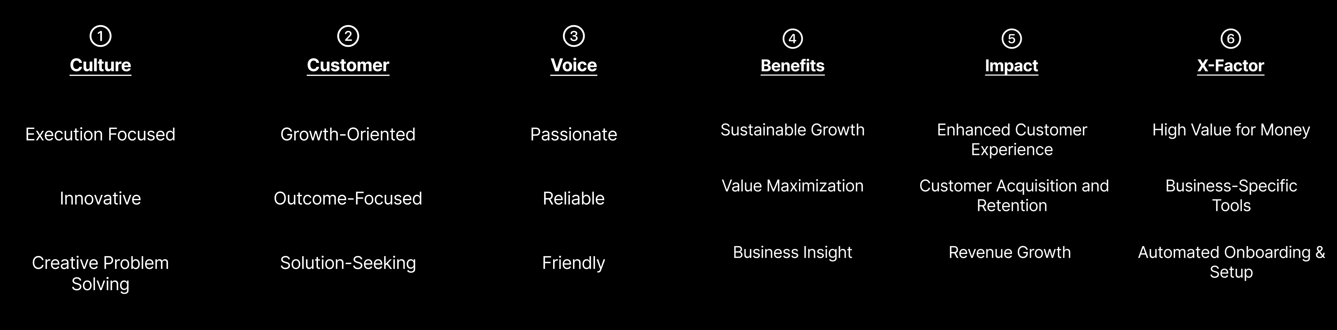
culture: how would our customers and employees describe us?
customer: how would we describe our ideal customers?
voice: how do we sound to others?
benefits: how other feel after interacting with us?
impact:what tangible impact do we have on others?
x-factor: how are we different from others? what makes us special?
then we prioritised what mattered and turned it into constraints. not “what we like”, but “what fits”.
2) three art directions → stylescape selection
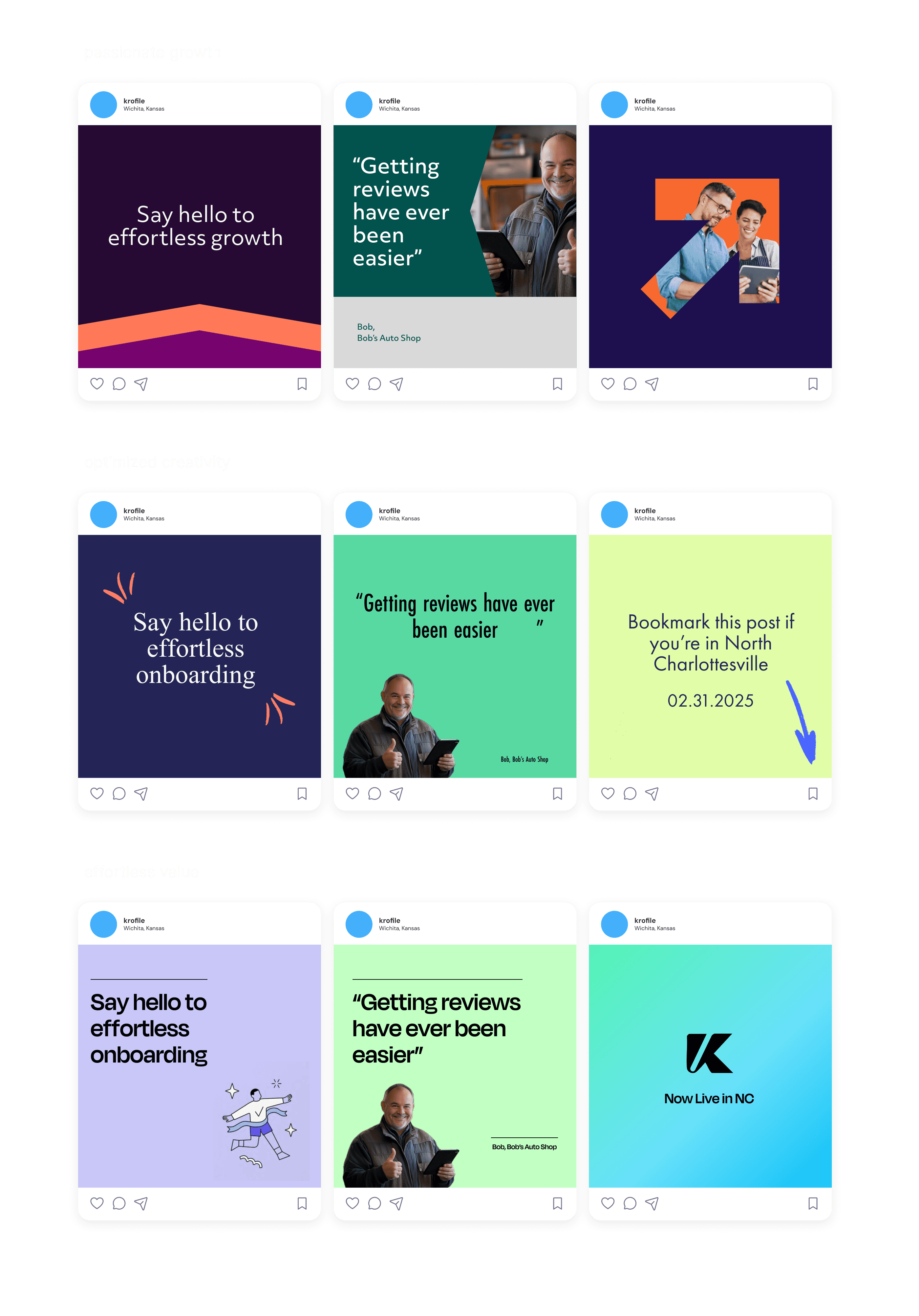
i built three full stylescapes. not just moodboards. complete worlds the team could react to. here's some cropped parts of the stylescapes (they are generally 3 times in length).
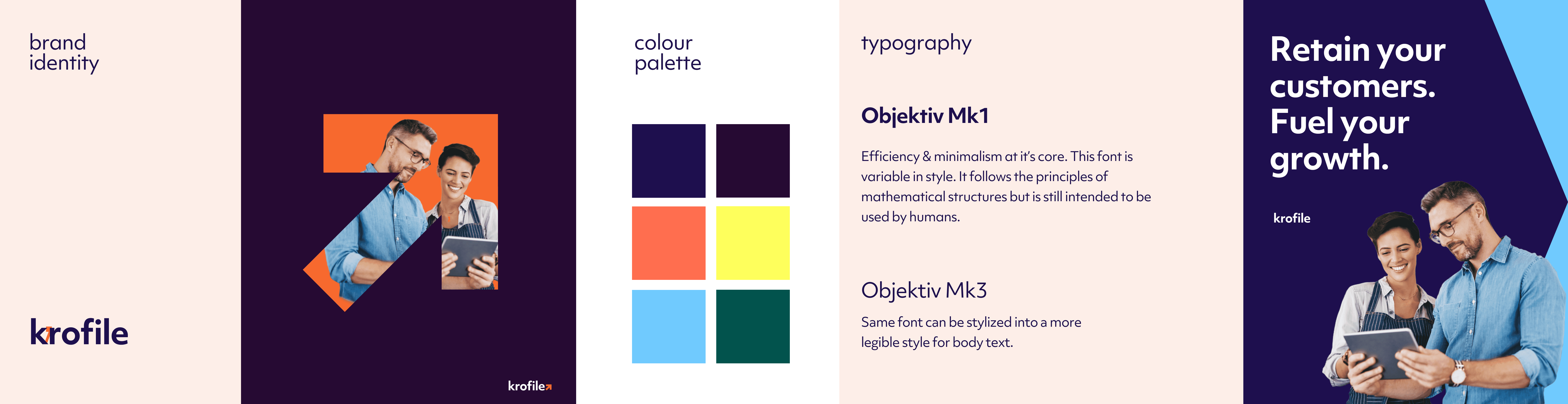
stylescape 1: passionate growth
type: objektiv mk1
feel: passionate, kinetic, foward momentum
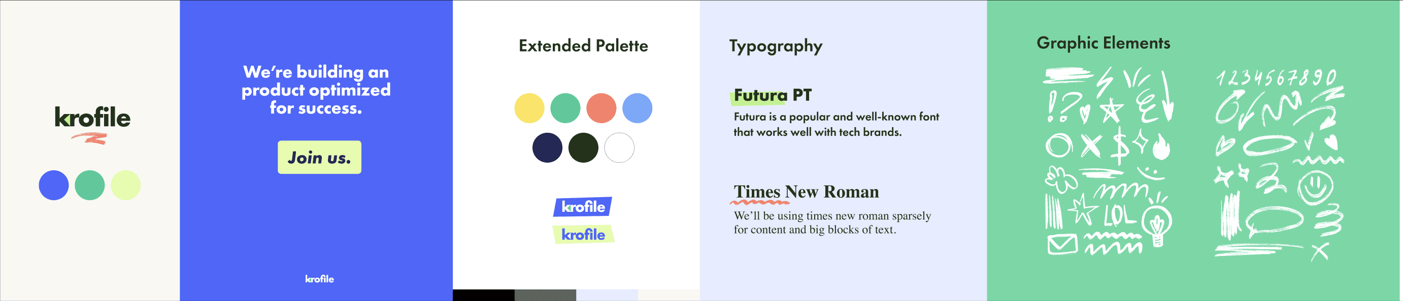
stylescape 2: optimized creativity
type: futura pt
feel: creative, efficient, tailored, performance-driven, customized
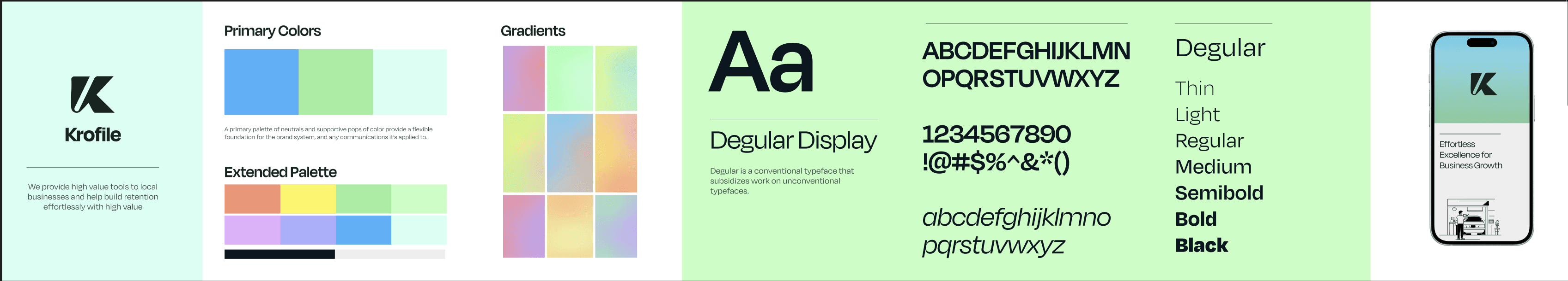
stylescape 3: effortless value
type: degular
feel: premium efficiency, high-value, simple, sophisticated
i facilitated a stylescape review workshop and pitched all three equally. rationale, tradeoffs, what each unlocks, what each risks. then i let the team debate and vote. my only condition was to chose 1 definite winner, and only borrow a few niceties from others if needed. 80:20 rule.
final direction: optimized creativity
creative energy, governed by structure.
why stylescape 2 won (and borrowed 3's typography):
it hit the balance krofile needed. it felt familiar without losing creativity. it created a hook competitors weren’t using, while staying disciplined enough to scale. it allowed to let the brand's aura feel professional and performant while have a garnish of creative freedom. it let customers feel that we've well designed systems yet it's easy to customize and personalize them for your own business. the futur font didn't borrow enough playfulness and was tad too serious of this brief, so we borrowed degular from third stylescape as it was professional and has a fun creative element.
3) identity system (built to scale)
once the direction was locked, i built the identity as a repeatable system.
logo: tied to the product mechanic
the mark integrates a qr-coded element to represent the offline → online bridge. it also signals:
growth: upward/outward flow with a subtle arrow form
momentum: curved + square elements that feel active but balanced
modularity: blocks that fit together, matching the toolkit nature of the product
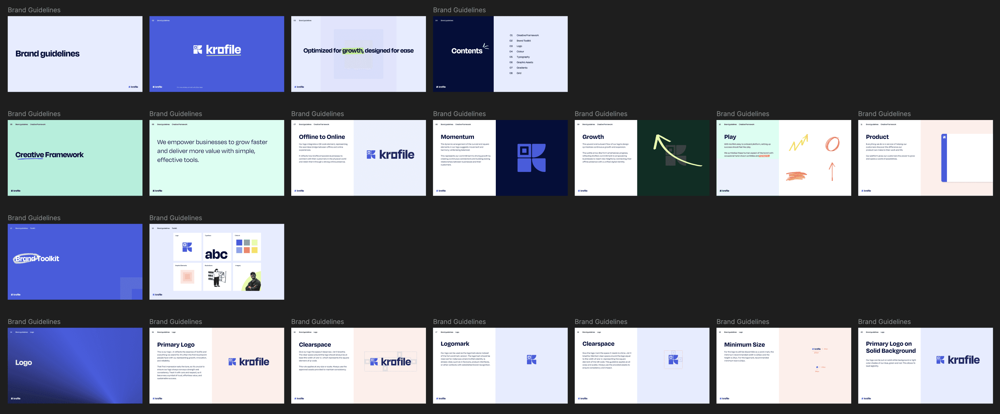
logo rules to prevent drift:
clearspace defined using the width of the “o” (the square qr element)
minimum sizes: wordmark 120px, logomark 24px
variations for light/dark/co-branded contexts
constraints for third-party use
color system: functional, not decorative
primary:
blue #455DE2 (primary)
green #17CC98 (accent)
neon lemon #E2FDA7 (highlight)
secondary:
deep blue #122173 (backgrounds, dark text)
light blue #64ABFD (secondary interactions)
yellow #FFE352 (alerts)
red #FF7C66 (strong messaging)
tints for backgrounds and controlled variety.
the rule: color earns its place. used for emphasis, states, and guidance. not decoration.
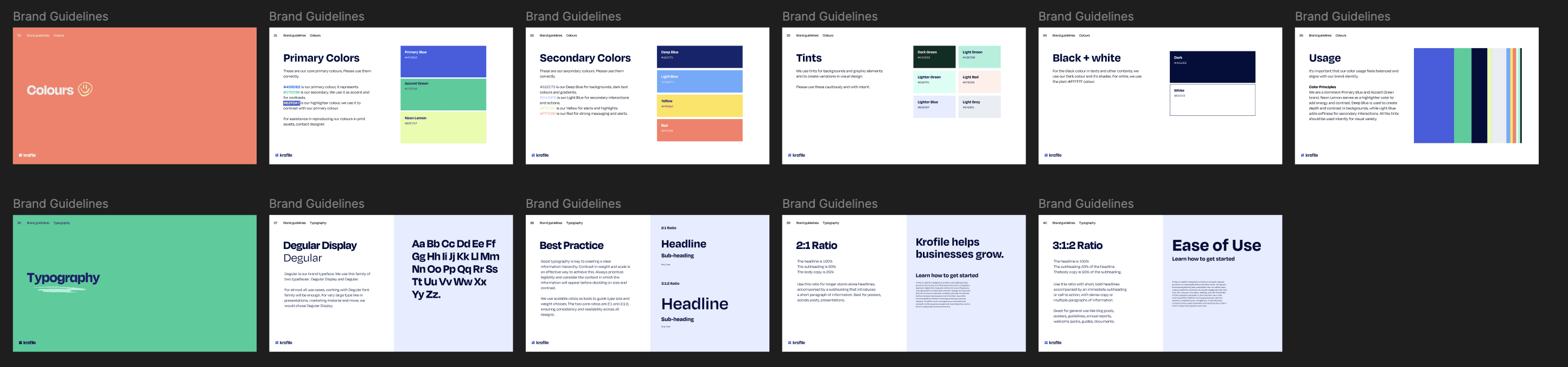
typography: built for real scanning
brand type: degular
large moments: degular display
hierarchy ratios: 2:1 and 3:1:2 so layouts stay consistent even when different designers ship new pages.
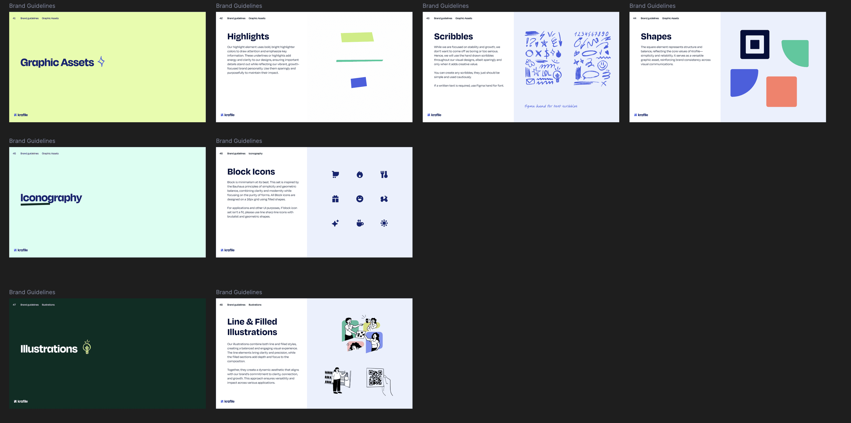
graphic assets: controlled personality
highlights: bright underline accents to pull attention
scribbles: hand-drawn elements (figma hand) used cautiously to add warmth without losing discipline
shapes: square elements to reinforce structure
icons: block icons, bauhaus-inspired brutalist geometry on a 16px grid
deliverable: a 51-page guideline as the single source of truth so the brand doesn’t drift.
4) krofile.com (built like a product, not a brochure)
i redesigned the public website end-to-end:
IA + sitemap: prioritised “what krofile does” (get found, retain customers, grow revenue) over feature dumps
low-fi: tested flow and hierarchy
high-fi: applied the system, iterated on key pages
handoff: multiple sessions with devs and a new designer hired mid-project
goal: fast comprehension. what it is, who it’s for, why it matters, what to do next.
the extra work (product ia, pro bono)
the scope was brand + website. but they asked for help on product structure, so i stepped in.
the nav was bloated: 18+ items under “profile manager” with no real grouping.
before: home, about, greetings, button links, review platforms, review showcase, team, promotions, media, faqs, menu, services & pricing, delivery platforms, wallets, gallery, languages, catering manager.
after: i did card sorting and regrouped into:
business profile (home, about, greetings, team, menu, services, gallery)
tools (reviews, promotions, media)
customer hub (faqs, support)
settings (integrations, wallets, languages)
i recommended cutting a few redundant items. they kept some because “it’s already built”.
i also worked on the consumer-facing qr landing pages. these needed to load fast, work on low-end devices, and make the next action obvious. i simplified layouts, prioritised ctas (save contact, leave review), and reduced cognitive load.
what made this work
1) people had ownership early
workshop + stylescapes + iterative reviews meant no surprises at handoff.
2) designed for real constraints
local business owners aren’t power users. the brand had to feel modern without being intimidating. the website had to explain value fast.
3) brand and product were treated as one system
the qr-inspired logo reinforces the mechanic. the palette works across marketing and ui. guidelines were strict enough to follow and flexible enough to scale.
4) the process forced decisions
the team had opinions. the workshop and stylescape voting weren’t consensus rituals. they were decision forcing tools so we could move fast without endless iteration.
outcome
krofile moved from “a product with a generic logo” to a brand system:
recognisable without shouting
expressive without losing structure
consistent across marketing surfaces
designed to scale without visual drift
the website launched feb/march 2025. i delivered final designs and guidelines.
what i’d want you to take away
user constraints and business reality drove decisions, not aesthetic preference
i built a system that works across marketing, product, and co-branded contexts
i surfaced disagreement early and forced decisions fast
i moved fast (2 months, fixed rate) without cutting quality
i went beyond scope when it materially improved the product
see also


