
docon
doctor-first iPad EMR. from pen & paper to 1m+ prescriptions per month.
00

problem
indian clinics wanted to digitise but the available tools were hard to learn, and didn’t hold up at live clinic pace. workflows stayed fragmented across doctor, reception, and patient touchpoints, so digitisation didn’t become habit.
solution
docon delivered a clinic operating system that was effortless to adopt: a doctor-first iPad emr for live consultations connected to ops, web emr, and patient experiences. tap-first structured capture, clear prescriptions, continuity, and reliability made daily usage stick.
designing a clinic operating system doctors actually used
I joined docon right when it was acquired by Pharmeasy’s parent, API Holdings as their first tech employee.
role: early employee, solo designer → design lead (scaled team to 5)
scope: full-stack product (iPad, web emr, ops, patient) + brand and marketing
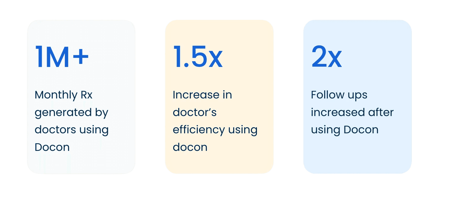
public impact: from 600 to 4.5k+ doctors, 30k to 1.2mn prescriptions/month
the problem
a clinic is not an app. it’s a system under pressure.
most clinics were stuck between paper (fast, but fragmented) and heavyweight EMRs (digital, but slow to adopt). tools were hard to set up, hard to learn, and broke down in live clinic conditions. work stayed split across doctor, reception, and patient touchpoints, so digitisation didn’t become habit.
design thesis
the consultation is the highest-pressure node. if the interface steals attention, doctors revert to shortcuts.
fast, but not risky
structured, but not rigid
reliable by default
consistent enough to become muscle memory
why iPad for doctors
the iPad fit the consultation. it stayed in the room without becoming a workstation barrier between doctor and patient, and it enabled tap-first interaction where typing is friction.
the bar was simple: quiet by default. decisive when it matters.
what changed
six design decisions that made adoption stick
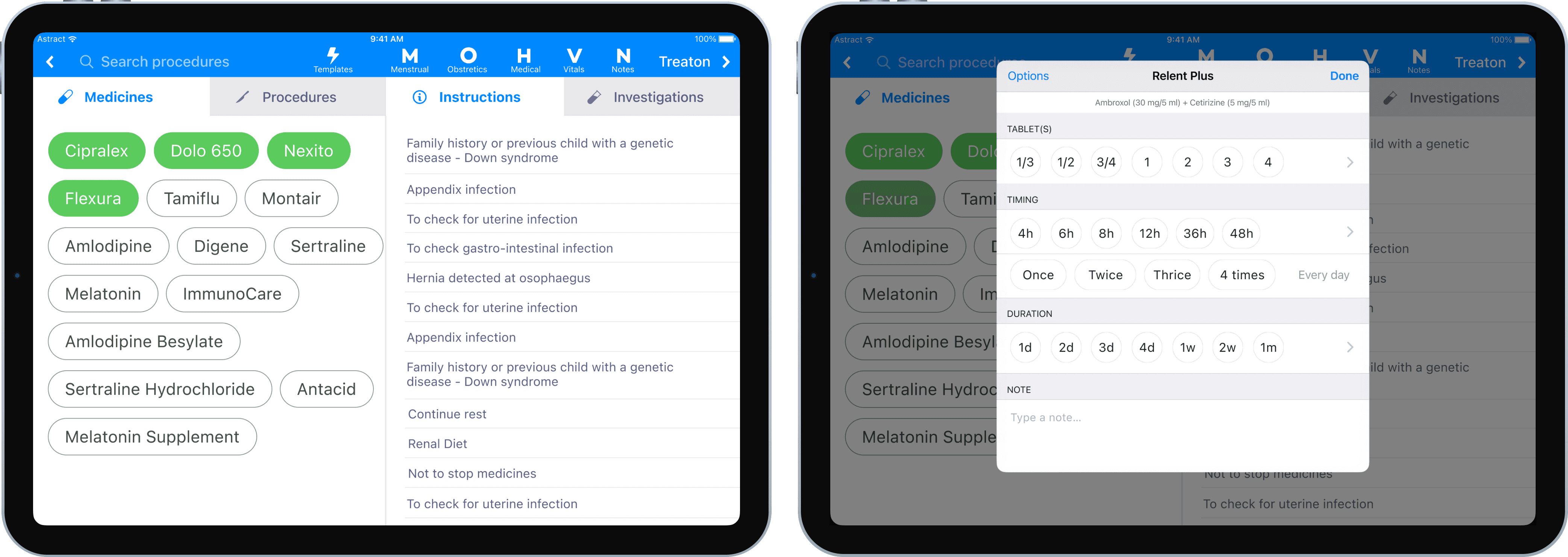
1) tap-first clinical capture
most EMRs treat doctors like data-entry operators. DocOn treated them like clinicians.
we shifted capture from typing-heavy recall to tap-first recognition, using structured choices for symptoms, findings, diagnosis, medicines, and instructions. replaced typing with recognition: chip/bubble inputs + smart defaults + behavior learning to rerank the bubbles, quick-edit affordances, with progressive disclosure for edge cases like searching medicines that aren't loaded offline, or adding new findings.
outcome: fewer consult interruptions, repeatable patterns, higher accuracy through guided capture.
2) the consult loop, rebuilt around intent
we rebuilt the core loop to match clinical intent: complaint → findings → diagnosis → treatment → instructions → prescription.
we kept decisions in one place, tuned hierarchy for scanning, and made repeat actions fast without making edge cases fragile.
outcome: lower cognitive load mid-consult, faster movement with guardrails intact.
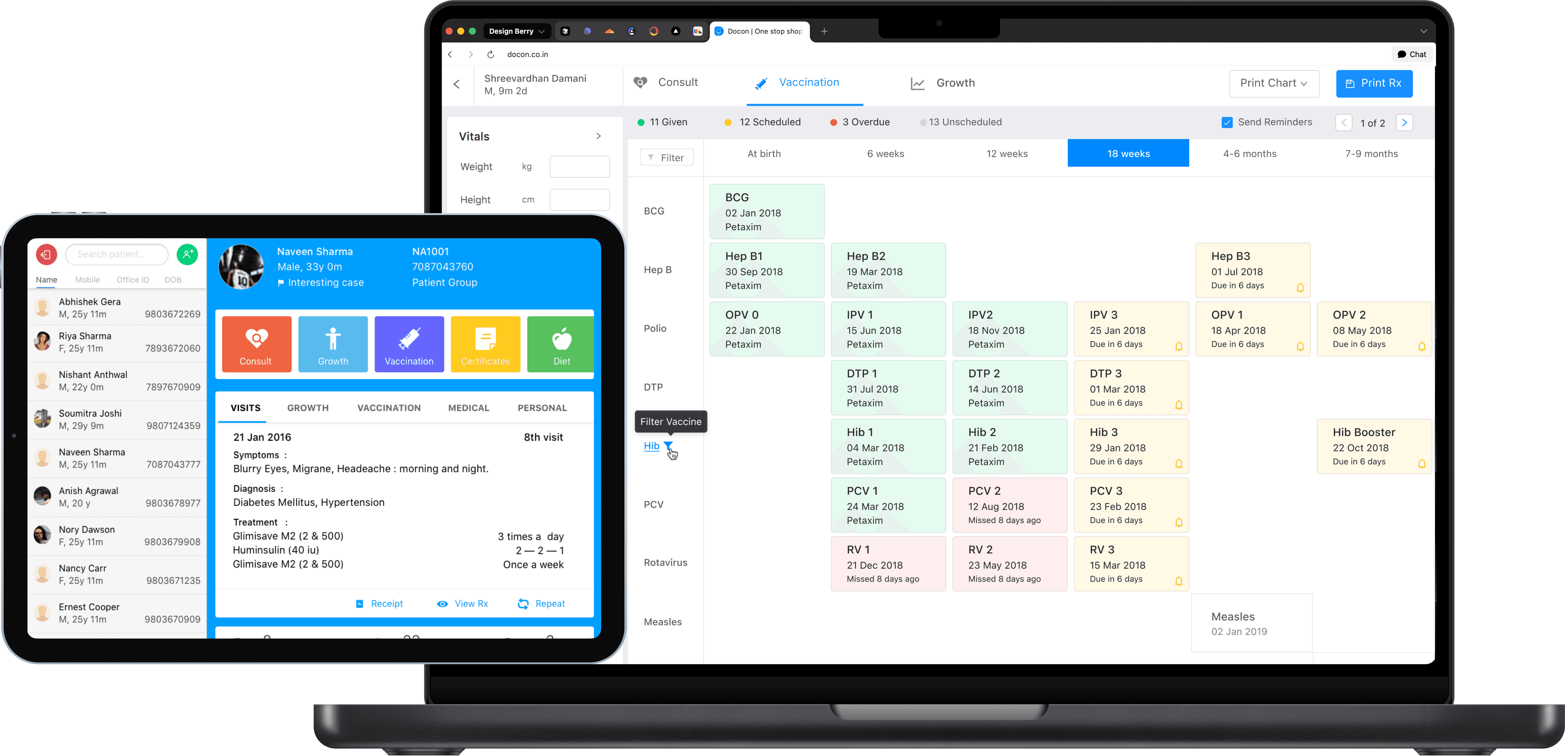
3) pediatrics as the stress test
docon was a platform, not a feature app. pediatrics proved whether the system could handle high-frequency, structured complexity without slowing the clinic down.
workflows like vaccination schedules, vaccination reminders, and growth charts weren’t “extras”. they validated the interaction model under real clinical structure.
outcome: clinical rigor at clinic pace, without turning the product into a form-filling exercise.
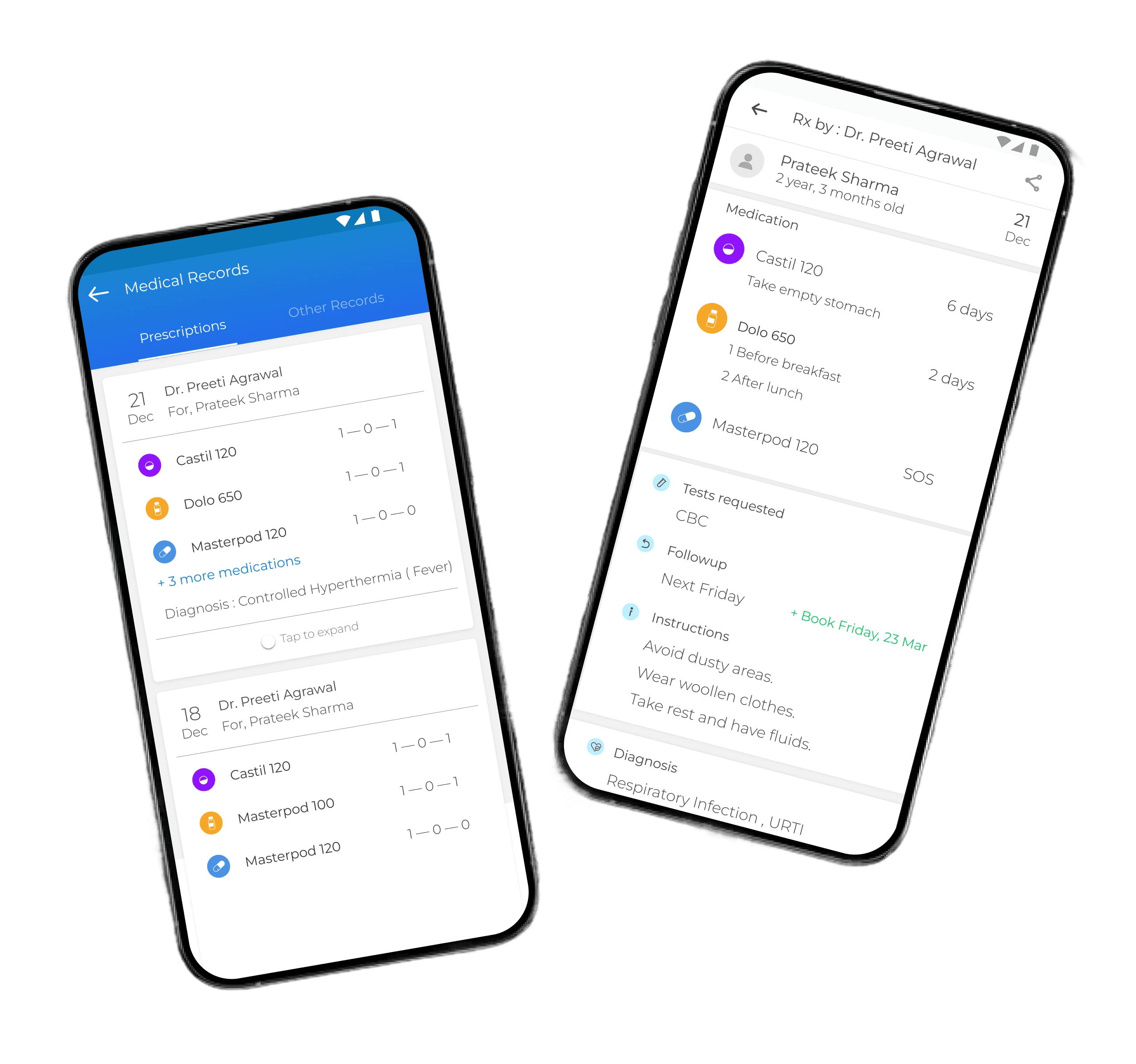
4) prescription as a trust artifact
a prescription is the patient’s take-home proof of care and the clinic’s reputation on paper. we treated it as a first-class design surface.
clear hierarchy, legibility, and reduced ambiguity in dosage and instructions, designed for comprehension at home.
outcome: fewer “what did the doctor mean?” moments, fewer clarification loops, better follow-through.
5) continuity built in
clinics grow through continuity. we embedded follow-ups, reminders, and relevant messaging flows into the core product. lightweight notes and tags helped doctors retain personal context so patients felt remembered, not processed.
outcome: continuity felt like care, not admin, and didn’t depend on memory.
6) reliability as UX
real clinics don’t have perfect connectivity. the consult cannot dead-end when the internet drops.
we designed offline-safe behavior, cached consult-critical data, and predictable fallback states. reliability was treated as product behavior, not infrastructure.
outcome: stable usage in real conditions, fewer trust breaks.
beyond the consult
one coherent ecosystem
a clinic doesn’t run on a single interface. the goal was not “many apps”, it was one system that felt consistent across roles.
reception and ops: appointment and queue workflows that kept the clinic moving without pulling doctors into admin
web emr: longer-form and administrative flows better suited to a larger screen
patient experience (web/app): access to prescriptions and records plus continuity touchpoints outside the clinic
clinic displays: waiting-room visibility to reduce uncertainty and front-desk load
design system: shared patterns and components so shipping stayed coherent as scope and team grew
process and validation
habit products punish guessing
failing silently is still failure when the tool is used all day.
we grounded decisions in clinic research (shadowing doctors and reception, interviews, beta testing) and validated with objective signals:
Appsee session recordings to spot hesitation, loops, and breakdowns
app events to track adoption and drop-offs
transactional data with the data science team to understand real behavior at scale
brand and scaling
making docon feel trustworthy everywhere
healthcare brands fail when they feel sterile or salesy. as the solo designer, i owned identity foundations and execution across product ui, clinic print assets, decks, social, campaigns, and internal docs. the product, the prescription, and the communication spoke the same language: competent, approachable, consistent.
scaling the function
as velocity and scope grew, i scaled design from 1 to 5 designers: set quality bars, built reusable systems, mentored, and kept output coherent while the platform expanded.
capabilities proven
ecosystem-level product design across doctor, reception, web emr, patient, and ops surfaces
interaction design for high-speed, high-accuracy clinical capture
habit-safe iteration guided by session recordings, events, and transactional patterns
trust built through clarity, guardrails, and patient-facing outputs
full-stack ownership: product + brand + print + social + production
scaling a design function from scratch to a team of 5 without losing craft
see also


